


WD2__ Beautiful website __part__2
Beautiful website___Part_2

Good:
- The art style is very nice
- It is simple and nice
- The picture box is very special and use the same art style
- the navigation font is very nice.
Bad:
- Some font types can be enhance
- The copyright part can put the below part
2. Online Profolio

Good:
- The art style is watercolor , is very nice
- Navigation part, visited's effect is very special
- The content is special art style.
- The layout is very suitable.
- Icon for facebook is quite interesting.
Bad:
- Navigation's font can enhance.
- Too many typefaces for this website
- Banner part, sometime will lag.
3. Banger's - Austin, TX

Good:
- A 80th years feeling.
- Is a nice art style for this
- The color by using is very match
- The layout for gallery is very suitable
- This website got show out the map
Bad:
- for the roller of navigation part, use wrong color
- The navigation banner had crop some part for the content.
- One of the content different art style with the overall, will weird.
4. Sensi Soft

Good:
- it is a html5 website.
- nice background and the style
- the animination part is very suitable for the website too..
- the navigation part is very interesting and attrack my attention.
- overall feeling, i like the mood and the feeling from this website.
Bad:
- the typeface maybe got little bit wrong adjustion
- when change page, maybe lag little bit
- when loading, maybe too slow.
- the layout no really can't find out, and just a little part
3. Banger's - Austin, TX
Good:
- A 80th years feeling.
- Is a nice art style for this
- The color by using is very match
- The layout for gallery is very suitable
- This website got show out the map
Bad:
- for the roller of navigation part, use wrong color
- The navigation banner had crop some part for the content.
- One of the content different art style with the overall, will weird.
4. Sensi Soft
Good:
- it is a html5 website.
- nice background and the style
- the animination part is very suitable for the website too..
- the navigation part is very interesting and attrack my attention.
- overall feeling, i like the mood and the feeling from this website.
Bad:
- the typeface maybe got little bit wrong adjustion
- when change page, maybe lag little bit
- when loading, maybe too slow.
- the layout no really can't find out, and just a little part
Labels: analysis, beautiful, WD2, website
WD2__Redesign Website_EuYanSang__Competitor Website_Analysis
For this WD2, our final project is redesign a website who give by the lecturer.The website that I need redesign is Eu Yan Sang (余仁生).
.jpg)
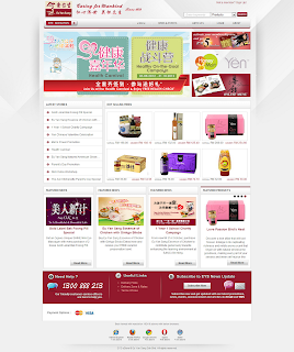
click to the image, and u will go to the website.
Good:
-The font for the headline is quite suitable
-Information( product, about, history, etc) is clear.
-The banner size is large and can know the lastest news.
Bad:
-Composition layout got little bit boring.
-Image for the product is no really clear.
-Milestone place is bored, can do more interesting
-The navigation roller effect can be more better
-Sitemap don't have all the page link.
-The style is very traditional.
-Sub- navigation is too many, and will look unmessy.
-It uses more then 3 font types.
------------------------
Beside, I'm also find some competitor website to compare.
1.Brands

Good:
- Simple and nice website
- background color is match with the logo
- Information is clear enough
Bad:
- the font types is no suitable for it
- some content's color use wrong for it
- the background is too empty
- the home page is too many information
- the layout may can try other
- product part is had waste some space for it
2. Korean Ginseng

Good:
- The location got show out the map
- The information is enough
Bad:
- The style and background is too empty
- The layout is no consistent
- The font types is no suitable for it
- some of the content had bad arrangement
3. Hai-O

Good:
- A simple and nice layout for it.
- the information is clear enough
- image is clear and big that can attrack pp
- some of the navigation is using the icon
- the content part had apply the dark shadow
- the products brands part is very interesting by using the image and logo
Bad:
- the font type maybe can use other
- some part for the content, can reduce to main point.
Labels: 2012, final project, redesign, WD2, website
Wee~ Is back to Analysis Website gain~
Jusrt____________-4 beautiful Website should Analysis1. grow interactive

Good:
-Have a big and clear image to grab people’s attraction.
-Will have a big title to describe the images
-The arrangement for the column is very simple and neat.
-For gallery, is good in arrangement and how to let show them out.
-Logo is simple and nice
Bad:
-For the roller navigation, can using different ways to apply the rolling / active effect.
-Contact page although have the designers’ contact way, but don’t have the leave msg box.
-When loading, got little bit slow
-The font types is no suitable for it
2.Koodoz

Good:
-The overall for the layout is consistent.
-Nice texture for the background and simple with the headline.
-Good title with the Icon to let the reader wouldn’t bored.
-Color and font is suitable for this website
Bad:
-The roller navigation part, is too dark for the navigation that chosen.
-The Favicon Gallery’s box is out of the layout.
-The introduce part and the contact part’s placement wrong.
-Some of the information ( link ) is too many and too long.
3.Loyselstoy

Good:
-Nice Background and different layout for this website
-The images are very interesting and can grab visitor’s attention.
-Font types are suitable for this website.
-The menu part is very creative with the drink icon.
-The information is quite interesting by using the infographics format
Bad:
-Waste the extra space for it.
-Some of the information can’t clearly see.
-The content is too crowding.
-The map’s color and the information is too nearer. The reader will confuse it.
4.Vamizi Island

Good:
-Image is big, nice and clear. It is enough to grab the visitor’s attraction.
-The content parts arrange properly and are easy to read.
-Below got sitemap to show the other page of this website.
-There also some information inside the banner.
-The layout is simple and nice.
Bad:
-Image of background should no repeat, or the background will look weird.
-Top for the layout don’t have the margin.
-The navigation is too top for the website, it can put below the banner.
-Arrangement for the content no consistent, you can find out some empty space beside it.
Another 4 just for _ commercial website.
1.Dixon’s Apples

Good:
-This is a website about the farm’s thing.
-The layout of this website is simple & nice.
-Navigations by using a simple concept & roll over the effect also simple.
-The sub-navigations also using some art style to present it
-It applies some texture for the background and logo.
-The images are clear and big. So, they can grab the reader’s attraction.
-The font types are suitable for the website.
Bad:
-About the content, it is too long. The content parts don’t separate to short form or few paragraphs.
-Besides, some of the space is wasted because don’t use it.
-Some image of product had been cropped with the information.
-There got 2 logos to make the visitor confuse which one.
-Color for the header and content is similarly, will hard to know which is title.
2.Jopp Design

Good:
-The art styles are very nice and match with the theme of website.
-The banner is big and clear. It uses the Jquey slideshow.
-The information (contact , about and other) can be find inside the website
-The headline and content can clearly to see it.
-Overall feeling is quite nice and simple.
Bad:
-About the product part, footer had missing
-The twitter part and the contact information can exchange the place.
-Some page, the information for the footer had run away
3. Organic food delivery service - Abel & Cole

Good:
-A creative art style with the farm theme.
-Menu, Price list and other information can be found inside the website.
-The layout is quite simple for it.
-Good for banner slide show have some introduction for the website.
Bad:
-Too many types face for it.
-It doesn't have the contact page.
-Too many image, don't know which one should be focus
-Some of the font is too fancy.
-The introduction for the page is too small.
-Color of the some pages is too colorful.
4. Story Ville

Good:
-A good art style and layout for the layout.
-The navigation design is very special.
-Nice and clear images.
-Good effect will choosing the title.
-Have 2 browser speed for user choose
Bad:
-Loading a page have little bit slow.
-Sometimes, the loading will hang for while.
-The store page is hard to find, need find from the sitemap
-It's loading and is very hang for it.
Labels: analysis, beautiful, commercial, WD2, website
Website tutorial by photoshop
I find these form those website tutorial
these are nice website design
and all by using software adobe photoshop.
Well, I will do these tutorial on this coming Sunday.
Hope I can create it similarly too =)

journal/personal type website <-- Click!


---- ---- ----
Besides that, I still find other tutorial tooLink will be down .. Visit it!
http://sixrevisions.com/photoshop/25-web-design-layout-tutorials/
http://www.tripwiremagazine.com/2011/06/photoshop-web-design-tutorials.html
http://creativenerds.co.uk/tutorials/70-tutorials-using-photoshop-to-design-a-website/
http://www.1stwebdesigner.com/tutorials/22-photoshop-web-design-interface-tutorial-sites/
http://vandelaydesign.com/blog/design/website-layout-photoshop-tutorials/
http://www.hongkiat.com/blog/40-greatest-web-interface-design-tutorials-photoshop-tutorial/
Good website Analysis (Example)
 |
| http://www.famouscookies.com/ |
Famous Cookies
- For the background, it is very match to the theme (about cookies). The color is using a color for it, and some white shadow for the main character. Besides, the color of bar is very match to the
background too. It has the toning for it, give the reader a "pop-up" feeling.
- For the column , the color also using the brown color. Besides, they choose the nearer brown colour, that's orange. So, the overall color is very soft and confortable.
- For the text, the color of the text is match to the background color. So, the different is no so much for it. Type of font is suitable for this website too. This website didn't use too many different types of font.
- For the image, they are very clear and big. So, the reader will straight to know and understand the important thing. Besides, it also can attrack the reader's attention. At least, the reader will no feel very bored for it.
- For the layout of the website, it is very simple and nice. The reader can easy to see the information and didn't feel confuse about it. Besides, the reader can find some laster news, popular thing or other in below of it.
- The function of it is very useful for the reader. How? Just slide the mouse to the title and it will show the sub-title on the column. So, the overall of this website is very good,confortable and easy to look.
---- ---- ----
 |
| http://www.ge.com/my/ |
GE imagination at work.
- For the background, it is a soft blue color. And it is just a simple background, a blank background. Between of this website, there is another color for it. A simple white color for it. Is a blank. It give reader a confortable and a clean feeling.
- For the column , actually no really look like the column. But it has its own style. Just 2 lines and make it dot. A simple and nice style for this website. It didn't have any color. It just has white as its background.
- For the text, the type for the text is very suitable with the background.
Why? Because it give the reader a confortable feeling. The kerning, leading or other style of font is simple. While the color for the text, only 3 color. And they look very match to the background.
- For the image, the main for the image is big and clear to see. The other image below of the website is nice too. Although is very small, but the graphic is simple.
- For the layout of the website, we can found out it is a simple and nice website. It doesn't have many column. So, we can easy to find out what we need. There also put some information with simple way too.
- The overall for this website is simple and nice. It gives the reader a confortable feeling. And is easy to read it.
---- ---- ----
 |
| http://themaninthesea.com/index.php/site/life/ |
The man behind The Sea
- For the background. A paper texture with a blank color. It gives the reader a natural feeling. Well, the owner of this website is using the contrast color- black color match with texture. So, it wouldn't bored with the background.
- For the column. Just uses a line and show out the column. The designer had make the column look like using pen or other draw a line. It gives a nature feeling. While at the choosen column, the
color just show out. It mean is in this page.
- For the text. A simple type font for this website. The color for the title is match with the overall color. The owner is using the brown color for Big title while sub-title had bold and black color. The
types of the font is very suitable for this website too.
- For the image. It is big and clear. So, the reader can see it clearly. The background of the image also simple with thinking.
- For the layout of the website, simple and easy layout. This website is a blog. So, the layout no really need complicate. Besides, below of the website, we can find out the site map for this website.
The readers will more easy to go to the page that they want.
- Is a nature background with a simple design. This website gives the readers a comfortable feeling. And feel interesting for it.
---
 |
| http://www.be-creative.org.uk/index.html |
be-creative. org.uk
- For the background.Simple white color with some graphic image.Behind of it, a blank grey color for it. Look contrast.
- For the content. The kerning and leading of the word is very good. So, the readers wouldn't facing trouble when read it. Well, the paragraphy for the body is using a good system. For example, didn't have '-' and other types crime.
- For the text. The types of the font is same with other page. But the different is style for them. Some of the title will put bold or italic. The color of the text is match with the website's theme. The nature color for it. Besides, the size of the font also quite suitable. So, the reader can know which is the title or body.
- For the layout. The layout is nice and simple, a normal column system. Besides, the margin and other character is show in this layout too. The contect for the website is very clear and put it with the layout. When in the other page, the layout of website is different with before. But is also count as a simple and nice column
system. The layout is no so complicate. So, the reader can read it in a confortable situation.
- This website gives the readers a confortable and clear feeling.
The image also grab the readers' attention too.
---- ---- ----
Labels: analysis, WD1, website
 Hi, Bloggers and my friends. I'm 19 years old. I'm a student who major multimedia design in TOA. This is my working blog. Inside this blog, include my college work, my own graphic work and some photography picture too. Any comment is important to me. Hope u can give me some comment if u visit here. Thanks and sit down visit it =).


