


WD2__Redesign Website_EuYanSang__Competitor Website_Analysis
For this WD2, our final project is redesign a website who give by the lecturer.The website that I need redesign is Eu Yan Sang (余仁生).
.jpg)
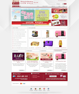
click to the image, and u will go to the website.
Good:
-The font for the headline is quite suitable
-Information( product, about, history, etc) is clear.
-The banner size is large and can know the lastest news.
Bad:
-Composition layout got little bit boring.
-Image for the product is no really clear.
-Milestone place is bored, can do more interesting
-The navigation roller effect can be more better
-Sitemap don't have all the page link.
-The style is very traditional.
-Sub- navigation is too many, and will look unmessy.
-It uses more then 3 font types.
------------------------
Beside, I'm also find some competitor website to compare.
1.Brands

Good:
- Simple and nice website
- background color is match with the logo
- Information is clear enough
Bad:
- the font types is no suitable for it
- some content's color use wrong for it
- the background is too empty
- the home page is too many information
- the layout may can try other
- product part is had waste some space for it
2. Korean Ginseng

Good:
- The location got show out the map
- The information is enough
Bad:
- The style and background is too empty
- The layout is no consistent
- The font types is no suitable for it
- some of the content had bad arrangement
3. Hai-O

Good:
- A simple and nice layout for it.
- the information is clear enough
- image is clear and big that can attrack pp
- some of the navigation is using the icon
- the content part had apply the dark shadow
- the products brands part is very interesting by using the image and logo
Bad:
- the font type maybe can use other
- some part for the content, can reduce to main point.
Labels: 2012, final project, redesign, WD2, website
 Hi, Bloggers and my friends. I'm 19 years old. I'm a student who major multimedia design in TOA. This is my working blog. Inside this blog, include my college work, my own graphic work and some photography picture too. Any comment is important to me. Hope u can give me some comment if u visit here. Thanks and sit down visit it =).


