


Website tutorial by photoshop
I find these form those website tutorial
these are nice website design
and all by using software adobe photoshop.
Well, I will do these tutorial on this coming Sunday.
Hope I can create it similarly too =)

journal/personal type website <-- Click!


---- ---- ----
Besides that, I still find other tutorial tooLink will be down .. Visit it!
http://sixrevisions.com/photoshop/25-web-design-layout-tutorials/
http://www.tripwiremagazine.com/2011/06/photoshop-web-design-tutorials.html
http://creativenerds.co.uk/tutorials/70-tutorials-using-photoshop-to-design-a-website/
http://www.1stwebdesigner.com/tutorials/22-photoshop-web-design-interface-tutorial-sites/
http://vandelaydesign.com/blog/design/website-layout-photoshop-tutorials/
http://www.hongkiat.com/blog/40-greatest-web-interface-design-tutorials-photoshop-tutorial/
Good website Analysis (Example)
 |
| http://www.famouscookies.com/ |
Famous Cookies
- For the background, it is very match to the theme (about cookies). The color is using a color for it, and some white shadow for the main character. Besides, the color of bar is very match to the
background too. It has the toning for it, give the reader a "pop-up" feeling.
- For the column , the color also using the brown color. Besides, they choose the nearer brown colour, that's orange. So, the overall color is very soft and confortable.
- For the text, the color of the text is match to the background color. So, the different is no so much for it. Type of font is suitable for this website too. This website didn't use too many different types of font.
- For the image, they are very clear and big. So, the reader will straight to know and understand the important thing. Besides, it also can attrack the reader's attention. At least, the reader will no feel very bored for it.
- For the layout of the website, it is very simple and nice. The reader can easy to see the information and didn't feel confuse about it. Besides, the reader can find some laster news, popular thing or other in below of it.
- The function of it is very useful for the reader. How? Just slide the mouse to the title and it will show the sub-title on the column. So, the overall of this website is very good,confortable and easy to look.
---- ---- ----
 |
| http://www.ge.com/my/ |
GE imagination at work.
- For the background, it is a soft blue color. And it is just a simple background, a blank background. Between of this website, there is another color for it. A simple white color for it. Is a blank. It give reader a confortable and a clean feeling.
- For the column , actually no really look like the column. But it has its own style. Just 2 lines and make it dot. A simple and nice style for this website. It didn't have any color. It just has white as its background.
- For the text, the type for the text is very suitable with the background.
Why? Because it give the reader a confortable feeling. The kerning, leading or other style of font is simple. While the color for the text, only 3 color. And they look very match to the background.
- For the image, the main for the image is big and clear to see. The other image below of the website is nice too. Although is very small, but the graphic is simple.
- For the layout of the website, we can found out it is a simple and nice website. It doesn't have many column. So, we can easy to find out what we need. There also put some information with simple way too.
- The overall for this website is simple and nice. It gives the reader a confortable feeling. And is easy to read it.
---- ---- ----
 |
| http://themaninthesea.com/index.php/site/life/ |
The man behind The Sea
- For the background. A paper texture with a blank color. It gives the reader a natural feeling. Well, the owner of this website is using the contrast color- black color match with texture. So, it wouldn't bored with the background.
- For the column. Just uses a line and show out the column. The designer had make the column look like using pen or other draw a line. It gives a nature feeling. While at the choosen column, the
color just show out. It mean is in this page.
- For the text. A simple type font for this website. The color for the title is match with the overall color. The owner is using the brown color for Big title while sub-title had bold and black color. The
types of the font is very suitable for this website too.
- For the image. It is big and clear. So, the reader can see it clearly. The background of the image also simple with thinking.
- For the layout of the website, simple and easy layout. This website is a blog. So, the layout no really need complicate. Besides, below of the website, we can find out the site map for this website.
The readers will more easy to go to the page that they want.
- Is a nature background with a simple design. This website gives the readers a comfortable feeling. And feel interesting for it.
---
 |
| http://www.be-creative.org.uk/index.html |
be-creative. org.uk
- For the background.Simple white color with some graphic image.Behind of it, a blank grey color for it. Look contrast.
- For the content. The kerning and leading of the word is very good. So, the readers wouldn't facing trouble when read it. Well, the paragraphy for the body is using a good system. For example, didn't have '-' and other types crime.
- For the text. The types of the font is same with other page. But the different is style for them. Some of the title will put bold or italic. The color of the text is match with the website's theme. The nature color for it. Besides, the size of the font also quite suitable. So, the reader can know which is the title or body.
- For the layout. The layout is nice and simple, a normal column system. Besides, the margin and other character is show in this layout too. The contect for the website is very clear and put it with the layout. When in the other page, the layout of website is different with before. But is also count as a simple and nice column
system. The layout is no so complicate. So, the reader can read it in a confortable situation.
- This website gives the readers a confortable and clear feeling.
The image also grab the readers' attention too.
---- ---- ----
Labels: analysis, WD1, website
WD1 "How To....?"
Web site design 1...The project is do a tutorial website..
While want to think the title "How To...?" , my head kena boom - -......
hard to think =X
- Who Am I - Bakery
- What is it- A Christmas cupcake
- What for – Christmas night party
- 1st task – Prepare the material
- 2nd task - Mix the material ( 1-3 steps)
- 3rd task – Bake cake (4-5 steps)
- Outcome – Many lovely cupcake in party
- Showcase – Cupcake gallery
How to create a DIY wedding ?
- Who Am I – Wedding Planning person
- What is it – A D.I.Y wedding
- What for – Couple who want have a D.I.Y wedding
- 1st task – Planning and decoration the place of wedding
- 2nd task – Prepare some D.I.Y and creative thing
- 3rd task – Decorate and do some food, some souvenirs
- Outcome – A different style of wedding
- Showcase – Wedding Photo Gallery
How to release the stress?
- Who Am I – psychologists
- What is it – relaxed
- What for – patient who have stress
- 1st task – reason of stress
- 2nd task - way of release (1st – 7th ways)
- 3rd task – way of release (8th – 15th ways)
- Outcome – More relaxed while doing the job
- Showcase – Info graphic
How to visit heritage penang?
- Who Am I - government
- What is it – journey
- What for – tourist
- 1st task – transport
- 2nd task –interesting location
- 3rd task – way to go
- Outcome – can visit heritage
- Showcase – info graphic / a map
Labels: final project, WD1
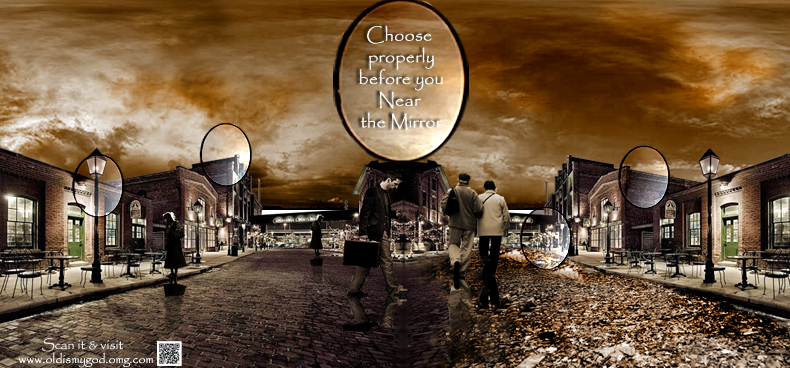
DSM1 ~ The final Project... BiG idea!
Well, for my final project. Is a Big Idea in this project.
My concept is about the old man.
Another, the slogan is about "Old is my god! OMG!"
So, will be continue~


Labels: DSM1, final project
DSM1 Project 2 Beautiful Information
Subject : DSM1
Project 2 : Beautiful Information
Title of my project : How many CLOTHES is THROW away every year ?
Software : Adobe Illustrator
Look like I choose wrong theme @~@ ..
This is quite hard for me.. Cause I'm no really understand for it .
So, I did many style for it..
And this is 1 of the 4th d..
Will, below is the final for this project.. So, how the look ? =D
.jpg)
Labels: 12th Night for u, 2012, DSM1, Project 2
DSM 1 Project 1 : Picture of Music
DSM1 got 3 project..
Hmm.. 1st project is about picture of music~
what this?
Oh! is a project .. haha..
well.. let me introduction my art work
---------------------------------------------------------------Project 1 - Picture of Music
Music: EF-A_Tale_of_Memories-Prologue (Please listen it )
Software: Adobe Illustrator, Adobe Flash, Adobe Photoshop
And this is my final art work =)
About my flash video, i may no upload it =)

Typography Fundamental
Finally, Typography Fundamental , one of my subject in year 2 sem 1 had come to end.
Well, I would want to thank Allan who taught me in this subject ^_^
Thanks for 体谅my physical problem
In these assignment and the final project, I try my best to do it.
I learnt those basic thing and more understand the typo thing. Is happy to learn about it =D
----------------------------------------------------------------------
Assignment 1 - is create a postcard
Title : Many Types typeface exhibitions.
I use two concept for these assignment.
The 1st of the postcard is Ink
And the 2nd of the postcard is Essay form


Assignment 2 - Top 10 Type Crimes
This is one of the lecture too.
Well, I also did 2 art works for this assignment too.


Assignment 3rd - Type
Is no really good.. hope u guys like it =)

Final Project - Poster of the Font
Bodoni Mt Black is my choose in this project
Well, I think I no really do well in this project.

Labels: 2012, Typography Fundamental
 Hi, Bloggers and my friends. I'm 19 years old. I'm a student who major multimedia design in TOA. This is my working blog. Inside this blog, include my college work, my own graphic work and some photography picture too. Any comment is important to me. Hope u can give me some comment if u visit here. Thanks and sit down visit it =).


